Contact Us Pages
Tips, best practices, and guidelines for creating an effective "contact us" page on your website.

Campbell Harrison has a fairly standard—but effective—“contact us” page for a consultant or contractor’s website.
Content style recommendations
Your Contact Us page should match the brand and tone that you’ve established for the rest of your marketing materials.
That said, you should consider the following guidelines:
Include a call to action
This matters especially if your business relies heavily on customers getting in touch with you. Consider a call to action that gives the customer an expectation of what to expect.
Examples:
- Get in touch with us to help scope out your project.
- Contact a friendly associate to get a customized quote.
Be friendly, open, and inviting
Most people cannot stand it when a company buries its contact information to save on costs. This is your opportunity to stand out from the crowd by not hiding.
Information to include
The types of information to include depend on your business, but here are the typical pieces.
Hours of operation
This is a must so the customer has a sense of when you’ll get back to them if they leave a message.
You may also want to set some additional expectations like, “We answer emails and tweets on the same business day.” Make sure you only make promises that your company can keep.
Phone and fax numbers
Some businesses struggle with managing the cost of answering the phone. We recommend figuring out a way to allow customers to call you.
Email address(es)
You may have one or many email addresses to list to the public. Though many email services offer good spam protection, plan for the fact that these publicly-listed email addresses will be picked up by spam bots.
Also, be sure to spell out email addresses, even if you use a mailto link. See
the Creating hyperlinks section of our Web Content Guidelines for more
information.
Location address(es)
List mailing addresses and any address that a supplier or customer may need to access.
Including an embedded Google Map or hyperlinking a map illustration to each address on Google Maps is usually a good idea so people can get directions to your location.
Email newsletter signup
Email marketing is still one of the most effective ways to promote your site and drive business through the web. If you have an email list, it’s usually a good idea to include a form for signing up on your Contact Us page.
If you don’t have email marketing capabilities yet, I recommend Mailchimp.
Links to social media pages
If your company has profiles on Facebook, Twitter, YouTube, Pinterest, Instagram, or others, be sure to provide links to them on your Contact Us page.
Where to link up your Contact Us page
The prominence of links to your Contact Us page really depends on your business. The 3 most common approaches are as follows:
- Link in the site’s global navigation
- Link in the site’s footer
- Link to a “location finder” in the upper right or footer
Here are some scenarios of when you’d use each approach.
Link in the site’s global navigation
- Your business provides a service or high-priced product, and most new business is initiated via phone or email.
- Your business handles a significant amount of customer support.
Link in the site’s footer
- You operate an e-commerce site whose primary function is to sell directly to the customer online.
- Your site’s main purpose is to provide information (e.g., journalism).
- Your site’s main purpose is to provide interaction amongst a community (e.g., forum, social media, Q&A).
- Your business’s customer support volume is relatively low.
Link to a “location finder” in the upper right or footer
- Your business has multiple locations (at least 4 or 5).
In this case, you should still consider having a Contact Us page in the global navigation or footer that provides information about your business’s headquarters.
Contact form guidelines
If your website is designed to collect lead information, having a contact form on your Contact Us page may make sense.
Require minimal information
You can make your contact form as complex as you’d like, but understand that the more fields you display and require, the less likely you are to get the visitor to fill it out.
Typical information to ask for is name, email address, and a text area for a message.
Also, make the message text area big enough to be inviting to write a real message. Some designers try to get too fancy and sacrifice space that should be made available for a real message.
Make sure that the form submit button looks like a button
This may sound like common sense, but I commonly see lead forms where the submit button looks like a link or is just a word. Make the form button look like a button so it’s 100% clear to the visitor what they’re supposed to do after filling out the form.
Protect the form page and submission with SSL
With all of the security issues floating around these days, every little bit of
security that you can provide helps. Assure users that their information is safe
by serving both the contact form and the action that it posts to with https.
Include more than just a contact form
Some visitors will love filling out the form and waiting for a response, but others want to call. Provide multiple options for contacting your organization.
Track the user’s filling out the form as a “goal” or “conversion” in your web analytics software
When you use the Goals feature in Google Analytics (or similar feature in other web analytics software), you can track important information like which sources refer the most leads to this form, effectiveness of lead-generating marketing campaigns, and more.
Use the HTML5 custom type attribute for email address and phone number input fields
If you use the type attribute for certain form fields, mobile device browsers
will change their keyboards to make entering that data easier.
For example, if you specify <input type="tel" ...>, the iPhone’s keyboard
changes as such for entering a phone number more easily:
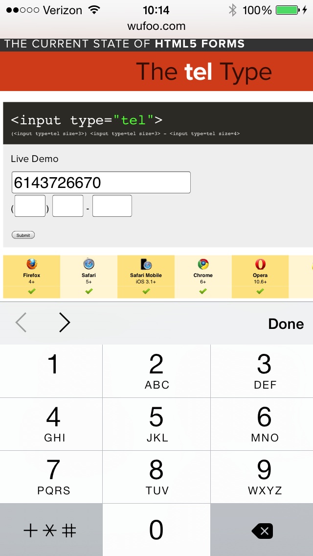
The iPhone’s keyboard adapts based on the type of input field defined in your
HTML markup. This example uses a type of tel for telephone numbers.
You should be doing this on all of your forms, but at least focus on your contact form and make sure it’s right.
Examples of effective Contact Us pages
ZURB
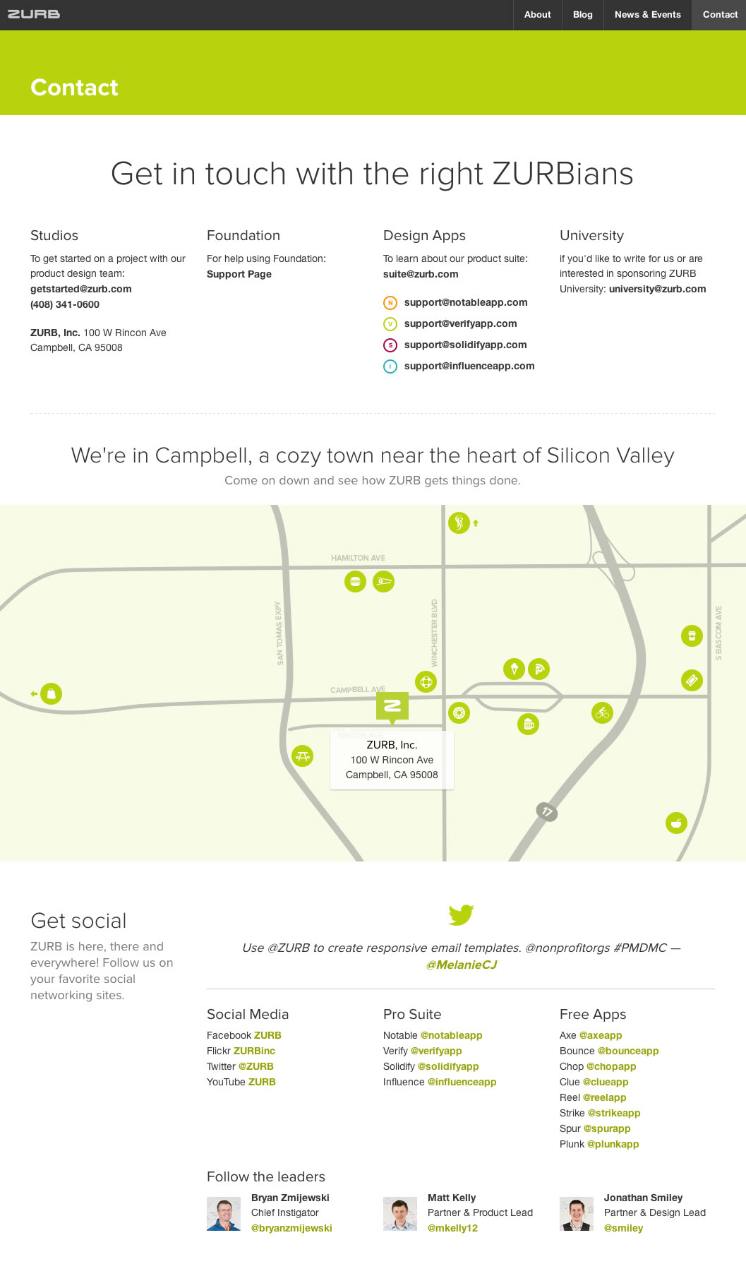
There are several different reasons to contact ZURB, and their Contact Us page handles it well.
- Includes the basics: mailing address, phone number, general email addresses.
- Map of location highlights activities in the area for prospective employees and other visitors.
- Includes links to social media accounts.
- Although there are more options on this page than most businesses require, they’ve done a nice job of chunking content in a logical order that doesn’t feel overwhelming.
Combadi
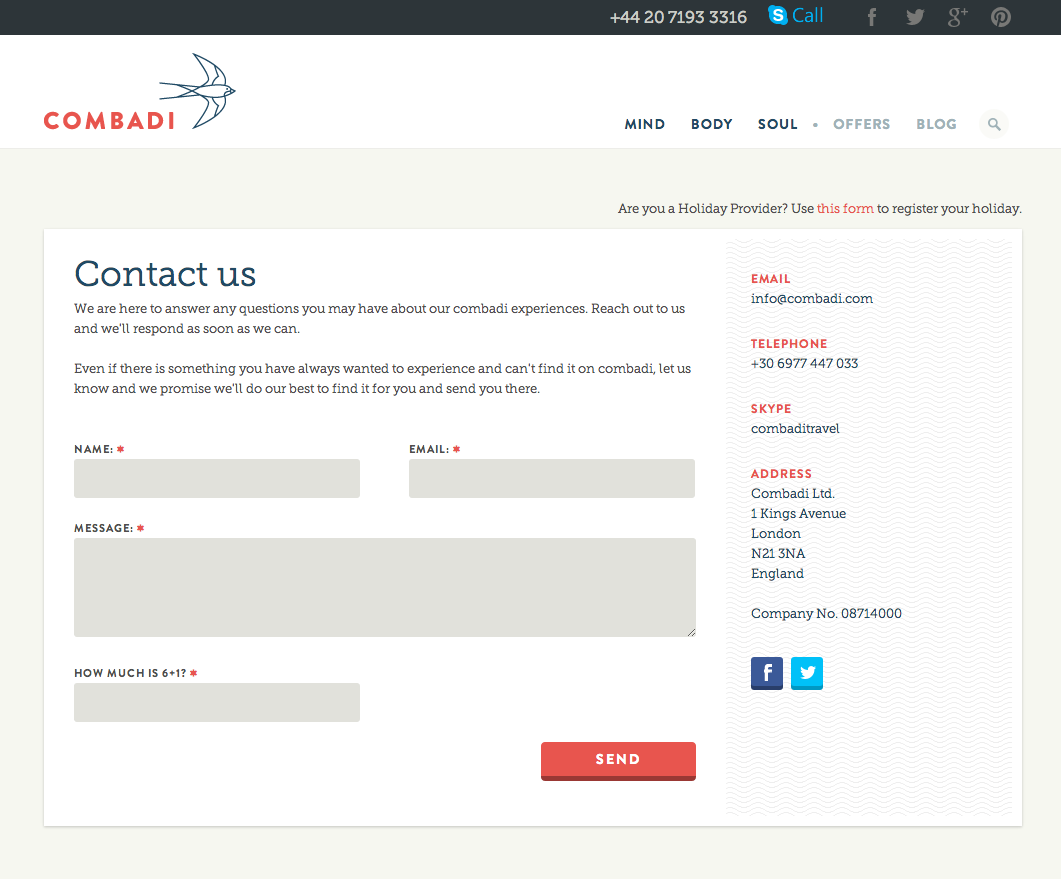
Combadi uses a simple layout to prioritize their contact form, and they offer other contact information in the sidebar. This is a nice, simple way to display all of the information on their Contact Us page.
- Contact form only includes the bare essentials.
- Secondary information is listed cleanly in the sidebar.
- Includes company registration number for those who may be seeking it.
- Includes links to social media accounts (though they appear to be missing links to their Google+ and Pinterest accounts, which you can see in the top bar).
The Barrelhouse Flat

Customers’ ability to find their location is of utmost importance, so the map takes front-and-center on The Barrelhouse Flat’s Contact Us page.
- Hours & location seize the opportunity to answer a frequently asked question asked by frequenters.
- Party-booking information is also explained to answer another potential FAQ.
- The illustration of the drinking hippo is a nice touch that keeps this page on-brand.
Related resources
- Web Content Guidelines, Playbook
- Conversion overview, Google Analytics Help
- HTML5 Forms: Tel Type Demo, Wufoo
- Contact, ZURB
Last updated on